 |
| One-bedroom Model Unit at the Marfori Tower at the Lake Front |
Get to know more about Doris Dy in this emailed interview with her:
DM: What was the inspiration for this one-bedroom condominium unit?
DDy: This design scheme was inspired by the colors gray, black and white and the fact that we need to showcase the unit as functional and liveable as possible.
DM: What was the intended client profile for the design of this one-bedroom unit?
DDy: This design was inspired by the company's COO who can be considered as an independent woman who has a passion for the finer things in life but at the same time can incorporate practicality with class.
DM: Can you tell me more about the design for this one-bedroom unit? What were your design considerations?
DDy: Since I am working for a developer, one of the design considerations that will eventually dictate the design process is the target market/prospect buyers. For this tower, they intended to dress up 3 types of units, namely: studio, one bedroom and 2-bedroom. We presented 3 schemes for a bachelor's pad, a young professional and a young couple who's just starting a family, respectively.
Although the units are quite small, we still wanted to do a layout that would emulate a similar layout found in big houses but of course with strategically placed furniture and built in items.
For this specific unit, the given niche was used as lighted display shelves. One wall was turned into an entertainment wall and storage with a sliding panel that serves as a cover of both the tv and the portion where condiments for food can be kept.
The bedroom can accommodate a queen-sized bed. A Parson's desk was strategically built along one side of the bed until the end of the corner window. This may be a bit tight but this serves as both the desk and dresser area. There's a play of texture by using wall paper, silk and sheer fabric.
 |
| View of the entertainment cabinet with a sliding panel that doubles as a storage for the dining area. |
 |
| Dining area is incorporated into the entertainment unit to save space. |
 |
| The living area in different shades and textures of gray fabric. An acrylic coffee table is a smart idea to make the space look spacious. |
 |
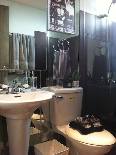
| The bathroom with mirrored wall panels on one-side give an illusion of more space. |
 |
| The bedroom minus the traditional use of a side table, and instead, a ledge running the whole length of the wall serves as a side table, a dresser and a space for placing things. |
No comments:
Post a Comment